

Hi, Hashnode community and welcome to day 13 of my Flutter challenge! 👋
Today I started the MDC codelabs series. You can find all of them here: docs.flutter.dev/codelabs#designing-a-flutt..
Material Design
I've been using Material for the web but it's always good to refresh my knowledge and see this powerful design library from a different perspective.
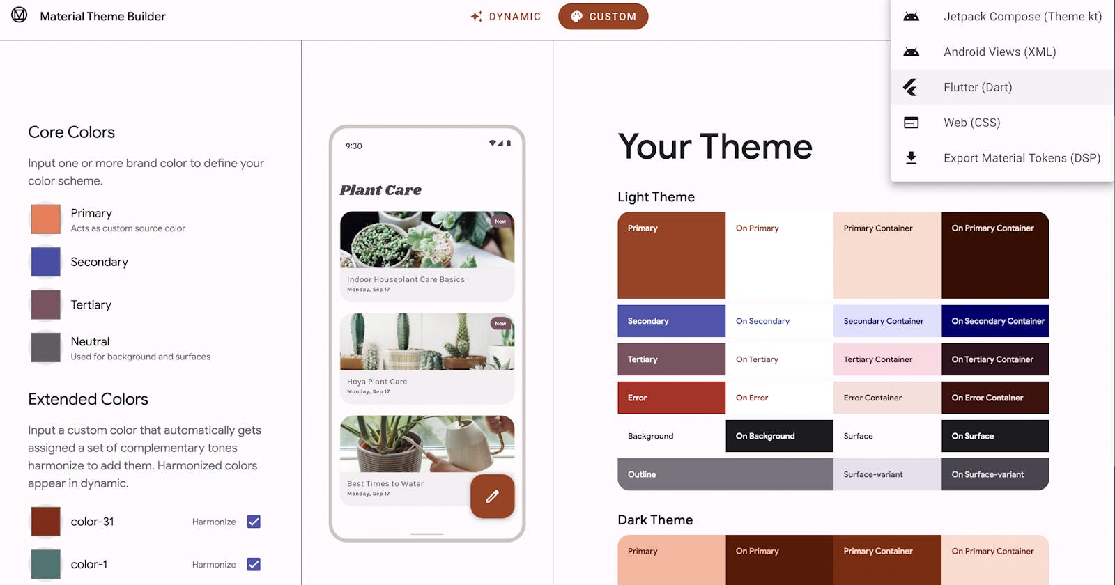
While learning Material for Flutter, I discover cool new tools that I haven't used before. One of them is Material Theme Builder.
Flutter is integrated with Material Design very closely, and I've been using MaterialApp widget from day 1 of my journey. Today I looked into buttons specifically.
Buttons
Material Design for Flutter comes with several button widgets:
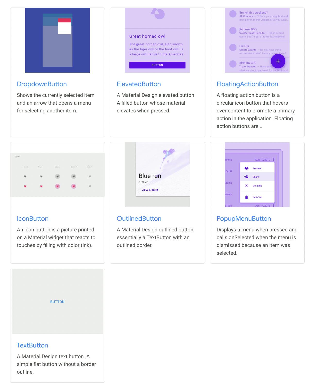
ElevatedButton- for primary CTAs (also known asRaisedButton)OutlinedButton- for secondary CTAsTextButton- for minor actionsFloatingActionButton- primary CTA button (usually circular icon) that floats above app contentIconButton- for tappable icons. There are some common implementations such asBackButtonorCloseButtonDropdownButton- lets the user select from a number of itemsPopupMenuButton- for dropdown menus
All of the widgets come with nice interactivity and with a handful of properties for customisation.
Widget of the day - OverflowBar
When we need to display multiple buttons in a row, the OverflowBar widget is a great helper.
It tries to display all its content in a row. If there is not enough space for that, it displays content in a column instead.
Below is my MDC-101 codelab with two buttons inside the OverflowBar.

Summary
Today I enjoyed working with Material Design in Flutter. Much easier than animations! 😄 As Material 3 has been recently released there is a lot more to learn. Stay tuned!